

A Practical Guide to Avalanche Analytics
Master the Avalanche data landscape with this comprehensive breakdown of the network’s premier analytics and onboarding tools.


Only a few things separate us from chimpanzees. One of those differences is our ability to analyze complex data sets. We love ingesting large amounts of information, identifying patterns, and making decisions about what to build, where to focus, and what to trust.
The network of networks knows this, and it has a growing set of analytics platforms to help us make sense of what’s happening across dApps, L1s, and everything else happening on-chain. These platforms provide builders and community members with clear signals about where momentum is building and how the ecosystem is evolving.
Avalanche Cascade
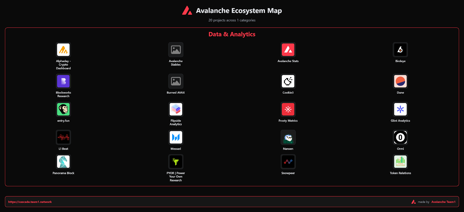
Cascade is Avalanche’s flagship onboarding tool designed for a broad audience, from brand-new Web3 users to developers and businesses. Created by Team1, Cascade offers several step-by-step paths for users to learn about the Avalanche ecosystem and get involved in their area of interest.
The Cascade ecosystem map has details on approximately 600 projects currently living on Avalanche. Instead of hitting you with a wall of raw numbers, it organizes the ecosystem by category so you can quickly find the project you’re looking for. It’s the perfect starting point if you want to explore what’s out there before you make decisions. Additionally, Team1 recently added features such as GitHub ranking and commit counts to most projects. Pro tip: keep an eye out for token data on applicable projects.
If you want to learn more about what Cascade has to offer, check out this comprehensive review by one of Cascade’s founders.
Messari Avalanche Portal
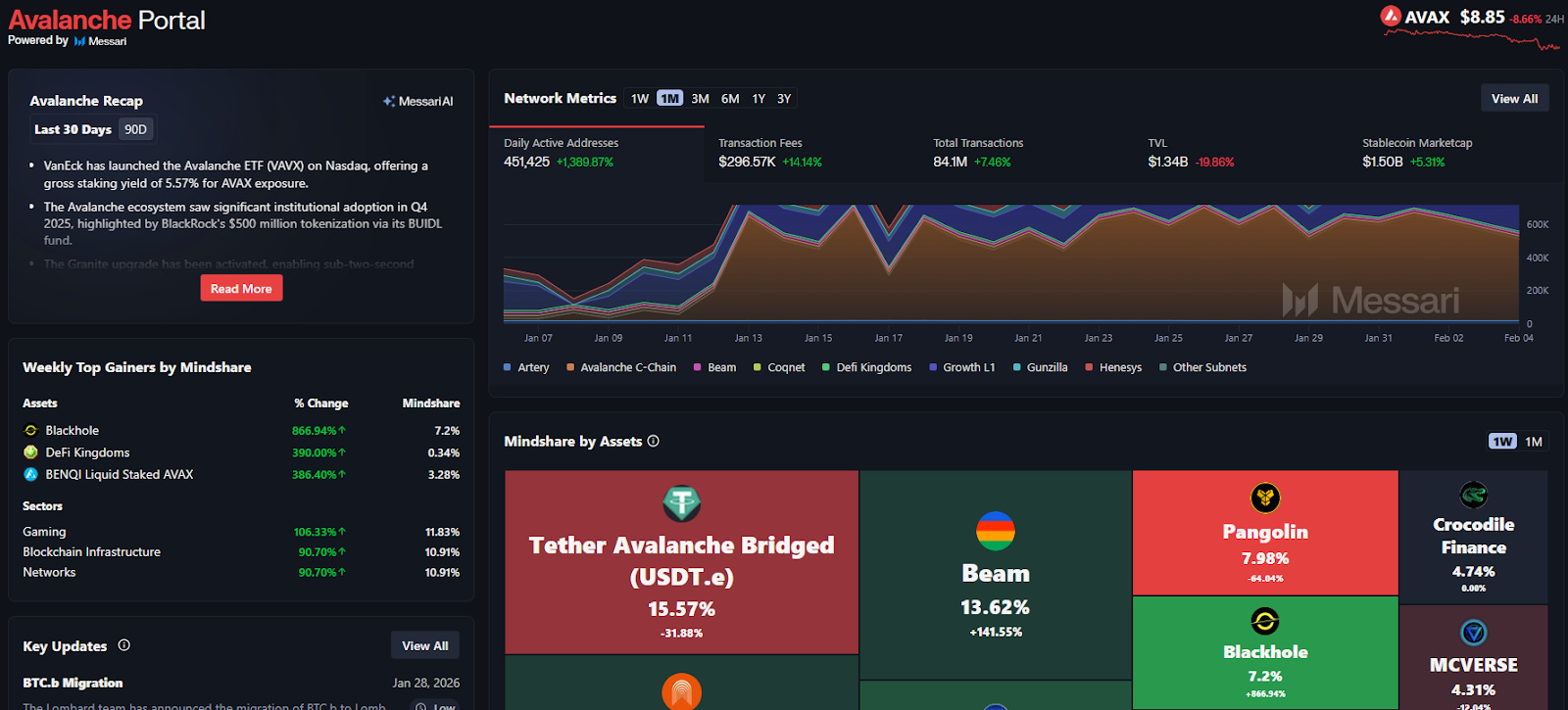
If you’re looking for an institutional perspective, Messari is a good place to start. This is where you go for quick snapshots of valuable metrics. Messari aggregates everything from transaction activity to quarterly research briefs, making it useful for anyone seeking to align narratives with raw metrics.
The Network Metrics section at the top of the page provides all the key data and allows you to filter by multiple timeframes. In the middle of the page, the Mindshare by Assets section shows what’s being discussed in real time on the network. And don’t miss the in-depth quarterly reports on the bottom left side of the page.
L1Beat
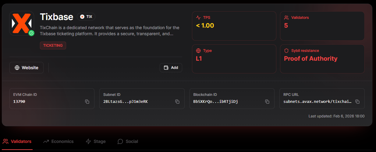
Avalanche’s interoperable L1 architecture is growing quickly, and it’s important to understand what each L1 does. L1Beat is hyper-focused on this. Even though it’s still in alpha, it has big plans to enable builders and investors to compare L1s across a wide range of metrics, helping to identify which ones are gaining genuine traction.
For example, by reviewing Tixbase, we can better understand its purpose and the number of validators, and, in the future, the addition of economic data will inform investors and users about its real-world usage. Plus, the snow animation is a nice touch.
Frosty Metrics
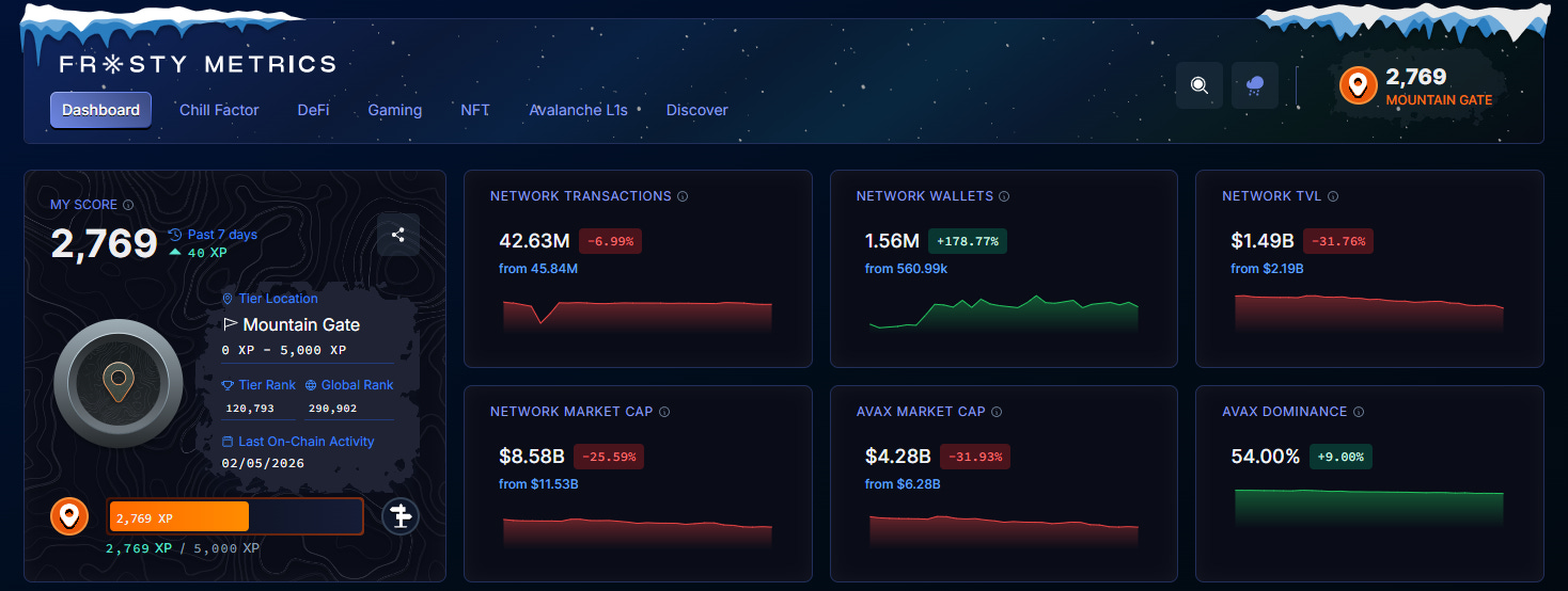
Frosty Metrics is well known for the Chill Factor score, which gamifies your on-chain history. This feature became the primary way to reward voters in the first Retro9000 program. Users voted for their favorite Retro9000 projects and were awarded an airdrop proportional to their Chill Factor score.
Toward the bottom of the page, Frosty Metrics provides users with intuitive displays of social activity, developer activity, and TVL. You can easily filter by 7-day, 30-day, and 3-month views to get an accurate picture of what’s happening on the network. And, as tradition dictates, Frosty also features a cool snow animation.
Snowpeer
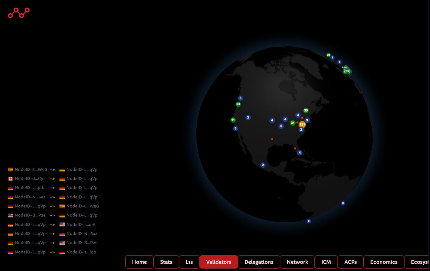
Snowpeer does a great job with data visualization. It measures metrics similar to those of other platforms, but the way it displays them is next-level. The navigation menu is at the bottom of the page, which is a little unusual, but it isn’t a problem after you get used to it.
The visual layout and animation of the L1 section are impressive, and you can click any icon to expand the data. Another standout feature is the validator globe, which displays an interactive UI showing the number of validators in a given region. But guys, we need a snow animation asap!
DeFi Llama
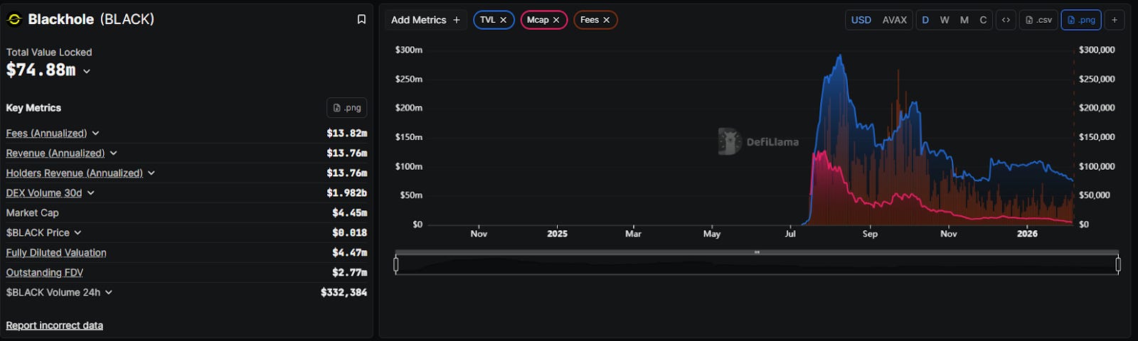
No toolkit is complete without DeFi Llama. While it doesn’t have the insider feel of an Avalanche-native tool, its transparency on TVL and DEX volume is the ultimate benchmark for how Avalanche stacks up against the broader market.
You can add metrics to the main chart in the upper right-hand section of the page, or you can scroll further down and search for DeFi projects. Once you find one you are interested in, let’s say Blackhole, you can then add similar metrics as you did for the entire network. It’s a great way to drill down from network to dApp stats with a ton of filters.
Final Thoughts
The chimpanzees are jealous of our ability to parse vast amounts of data, so don’t let this evolutionary advantage go to waste. What you should do is click on the links in this article and find interesting ways to slice and dice all the data. You will come out on the other side with new wrinkles in your brain. Whether you’re looking at the Cascade ecosystem map to see what’s out there or checking your own Chill Factor score, there is a tool for your specific need. Happy clicking!
Dive into the Avalanche ecosystem today! Download the Core Wallet and unlock a world of seamless DeFi, NFTs, and more.
 | A guest post by
|